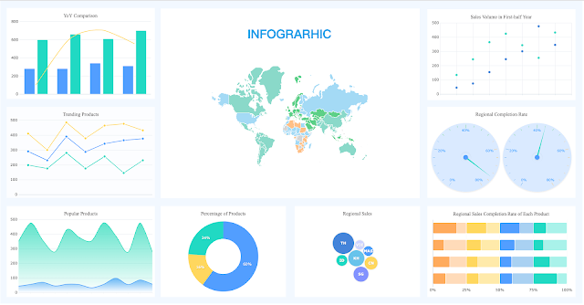
How is data visualized?

● Having clarity of the target audience is very important while designing visual (chart) of a graph which should always be done based on the audience that will view it.
● Relevant content type and a clear idea or goal should be conveyed by graphic images.
● Data can be of any sort or kind in the market. Therefore different data plots and charts are required for different kind of information. Hence selection of correct chart type plays a vital role.

● Various colors are used as a tool in the study of market trends. Thus, different colors are required while depicting data as it catches the eye. For example, green can be used to show increase in sales whereas red to show decrease in profit rate.
● Usage of tools for creation of data visuals is one of the easiest ways to make the graphs intuitive as well as easy to read.

Comments
Post a Comment